In brief
For more than four centuries the Mercator map has defined how we see the world, but the projection exaggerates polar land and underplay equatorial continents. In 2026 the UN General Assembly voted to adopt the Equal Earth projection to correct Africa’s mis‑representation, yet the choice still triggers debate over accuracy, navigation and visual bias. The switch spotlights the deep trade‑offs in map-making—area, shape, distance—while reminding us that maps influence politics, economics and cultural understanding.
For centuries cartographers have struggled to flatten the globe without losing key features. The Mercator map, created in 1569, was originally designed for nautical use. Its great advantage is that lines of constant compass bearing stay straight.
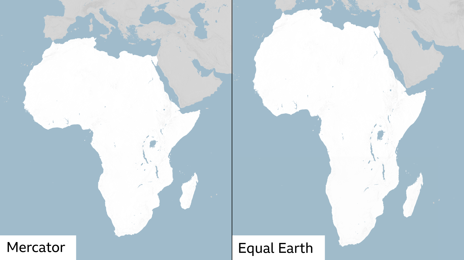
The same adjustment that preserves angles also stretches areas as they move toward the poles, turning Greenland roughly the size of Africa. When the world map is taught in classrooms or shown on a Google screen, that distortion persists and shapes how people judge what is large or small.
In 2026 the United Nations General Assembly voted for a new world map. The resolution not only criticised the Mercator’s bias, it adopted a map called “Equal Earth” that keeps land area ratios more faithful. The project arose from a 2018 team of cartographers who re‑imagined the sphere to display size fairly while still keeping a pleasing shape. It shows Africa many times larger than the old map, addressing a decades‑old political and economic injustice.
Equal Earth is an improvement, but none of the classic projections are perfect. The Peters projection, for example, has no shape distortion but it crushes the poles and stretches the equator, giving the North Pole a misleading very small appearance. Likewise the Robinson and Azimuthal Equidistant maps sacrifice straight lines or constant direction, making them unsuitable for navigation but useful for distance‑oriented imagery.
Map makers explain that preserving area, shape and direction cannot simultaneously be achieved. When you want a map for charting a course, you sacrifice how land sizes look. When you want an unbiased view of where continents sit in reality, you give up straight compass lines.
The UN’s adoption of a new map changes the stage. It stresses that the way we view geography matters, even if it seems purely technical. In Kenya, for instance, scholars note that a smaller visual Africa can lead to under‑investment and a softer public image of resources. By adjusting the picture, the map can change expectations and policy.
The choice of projection mirrors politics: a North‑centric map frames the world’s power dynamics, a South‑centric view invites a different narrative. Images like the Azimuthal Equidistant projection, which centers on the North Pole, illustrate how a single design can re‑order the globe and the world’s stakeholders.
What the UN moved forward with is not the perfect solution, but a step toward equity in our visual tools. It also highlights an ongoing conversation about how we represent the planet—what to emphasize, what to round, what to ignore—even as new technology and scholarship continue to supply fresh ideas for balance and accuracy.